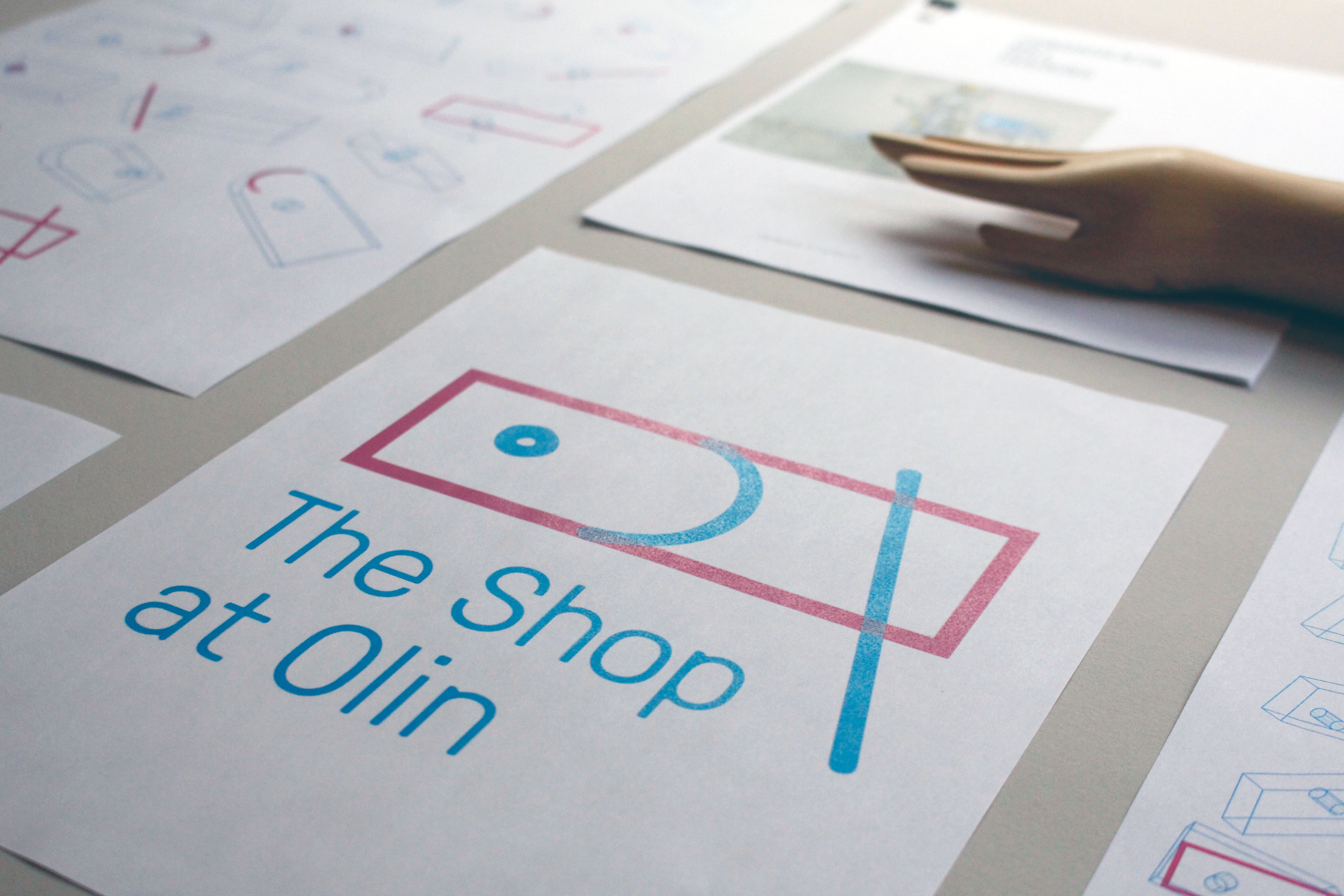
THE LOGO SYSTEM
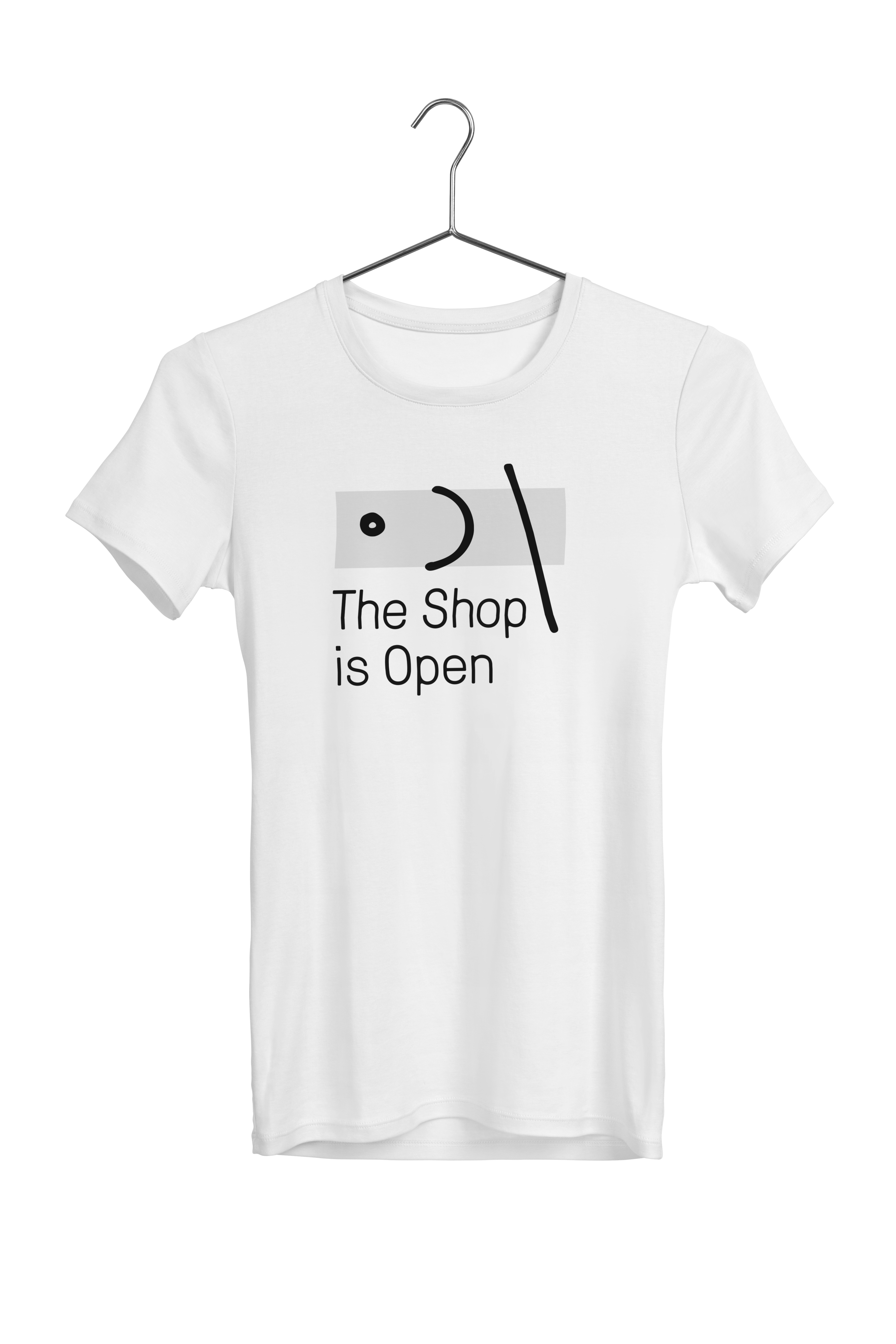
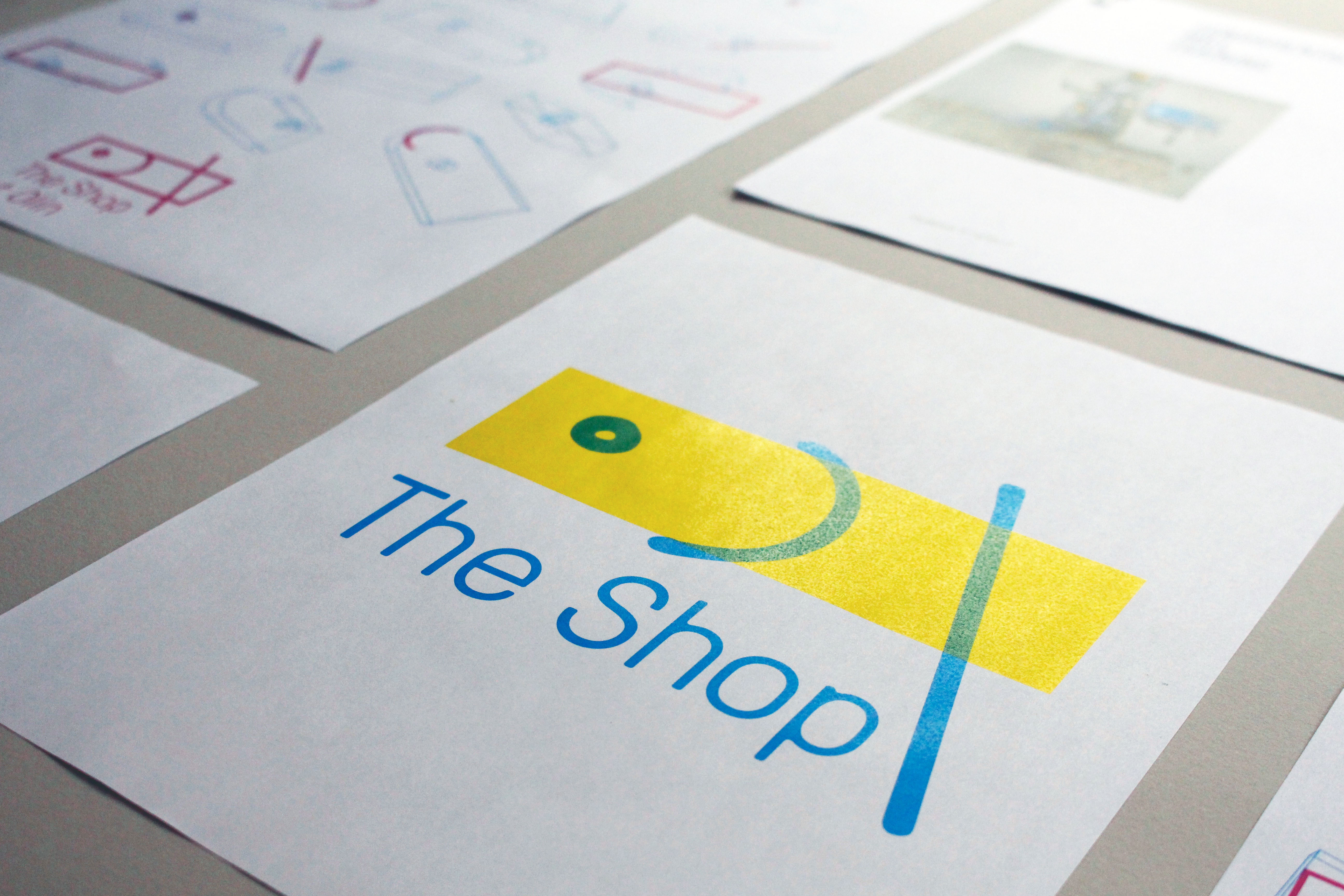
Through conversations with the Olin team, we developed a brand voice for the shop that revolves around an authentic, equitable, and accessible experience for all. The “equity, authenticity, access” mantra steered us in all of our subsequent work. The logo itself tries to subvert the typically precise and analytical representation in engineering drawings by using playful linework and recombinant parts.
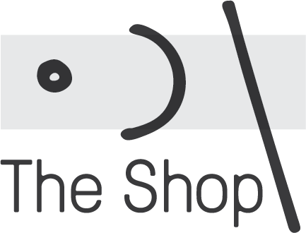
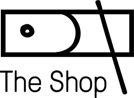
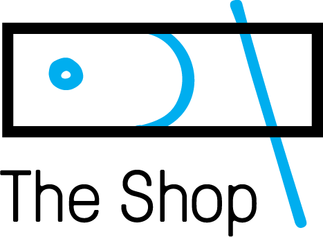
The Practice Piece
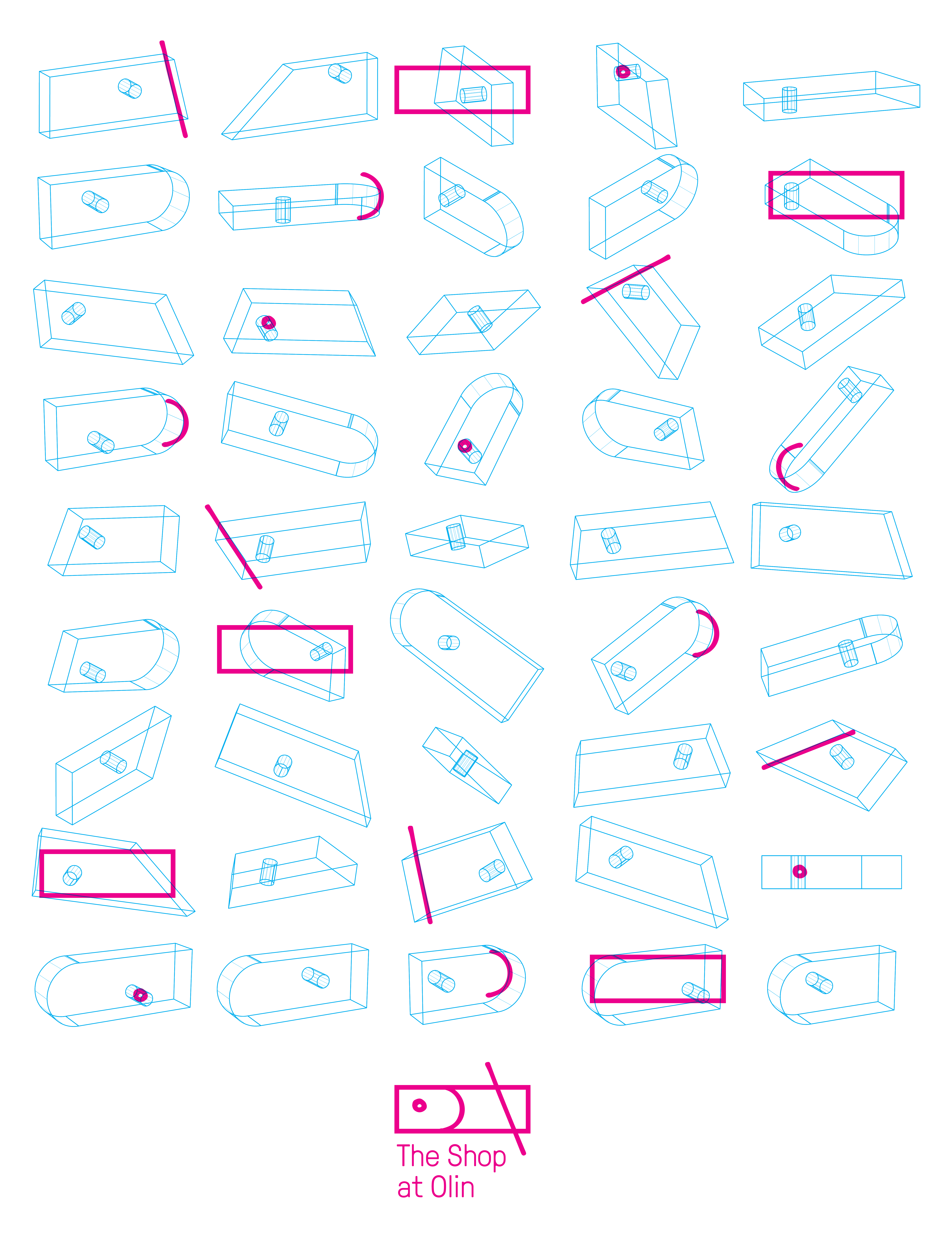
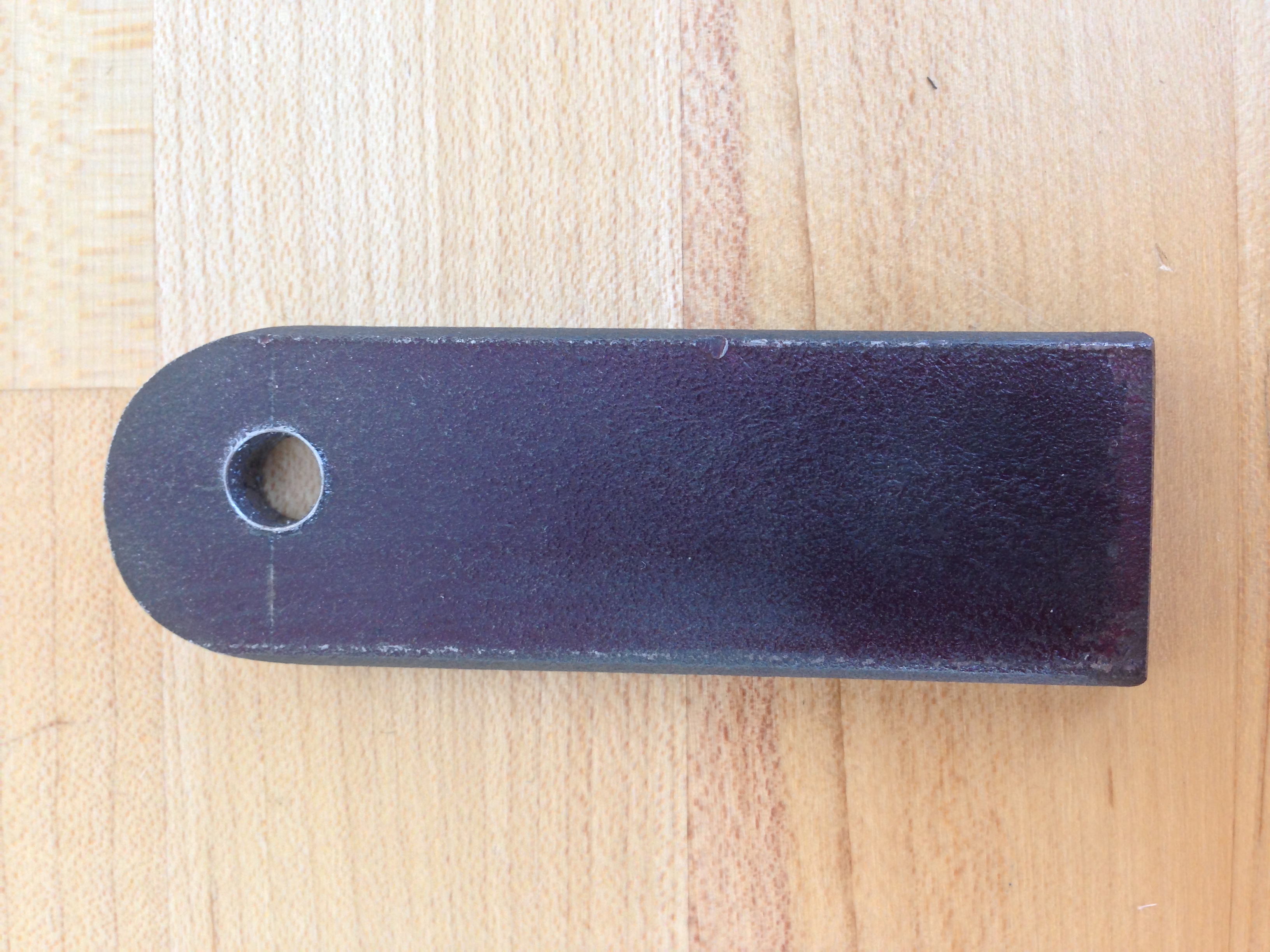
The form of the logo captures a shop experience shared by all students at Olin. In every student’s first weeks at the school, they are asked to produce a “practice piece” by performing three basic operations on a piece of steel: drilling a hole, making a jigsaw cut, and rounding an edge. Each student’s execution of this piece is unique, but the shared experience of making the part ties the community together. It felt like a perfect microcosm of the organization at large.
Individuality with Unity
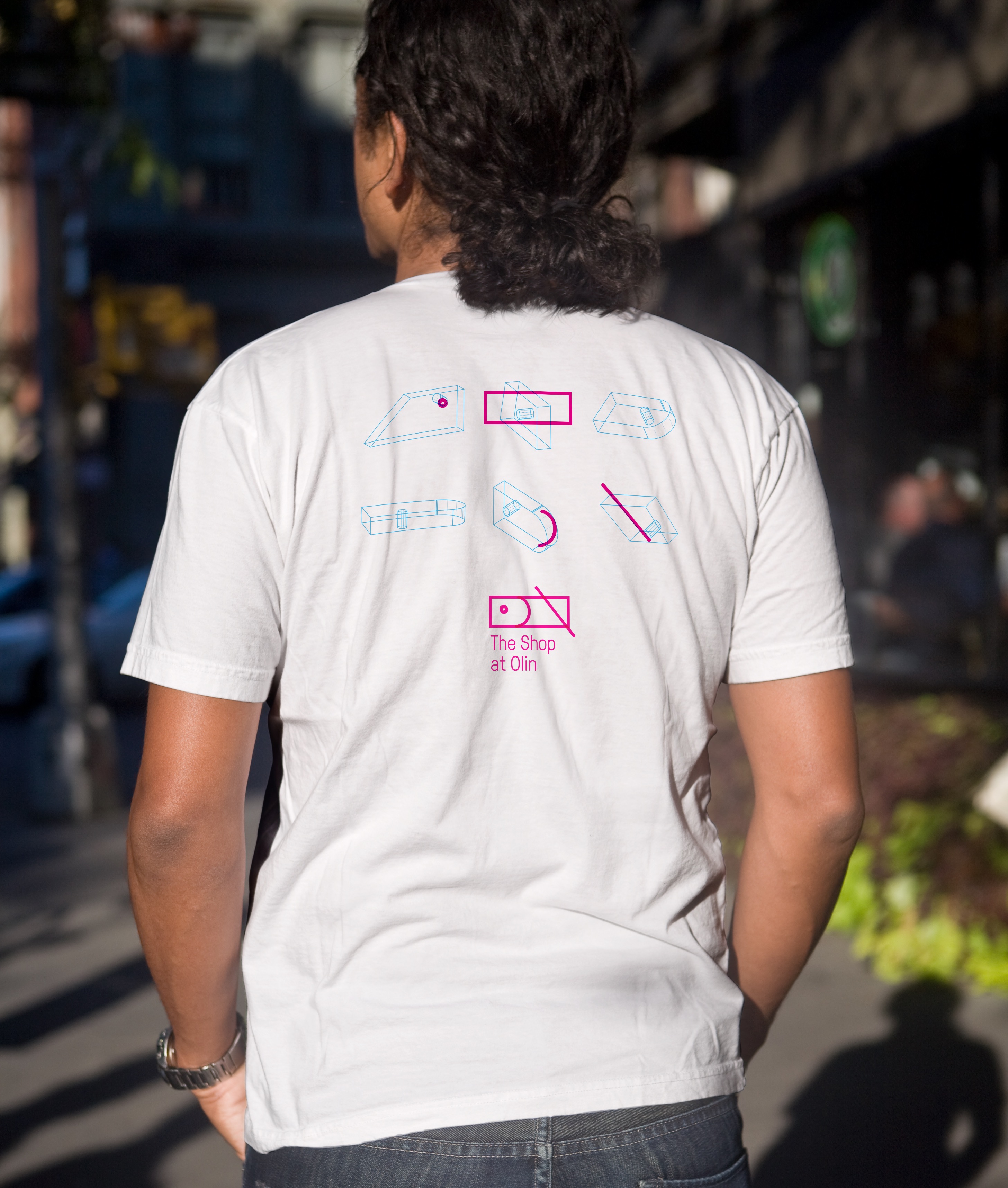
The individual elements of the combine in different ways, representing both the individuality of each shop member, and the shared set of values, principles, and practices that they’re committed to as a group.
